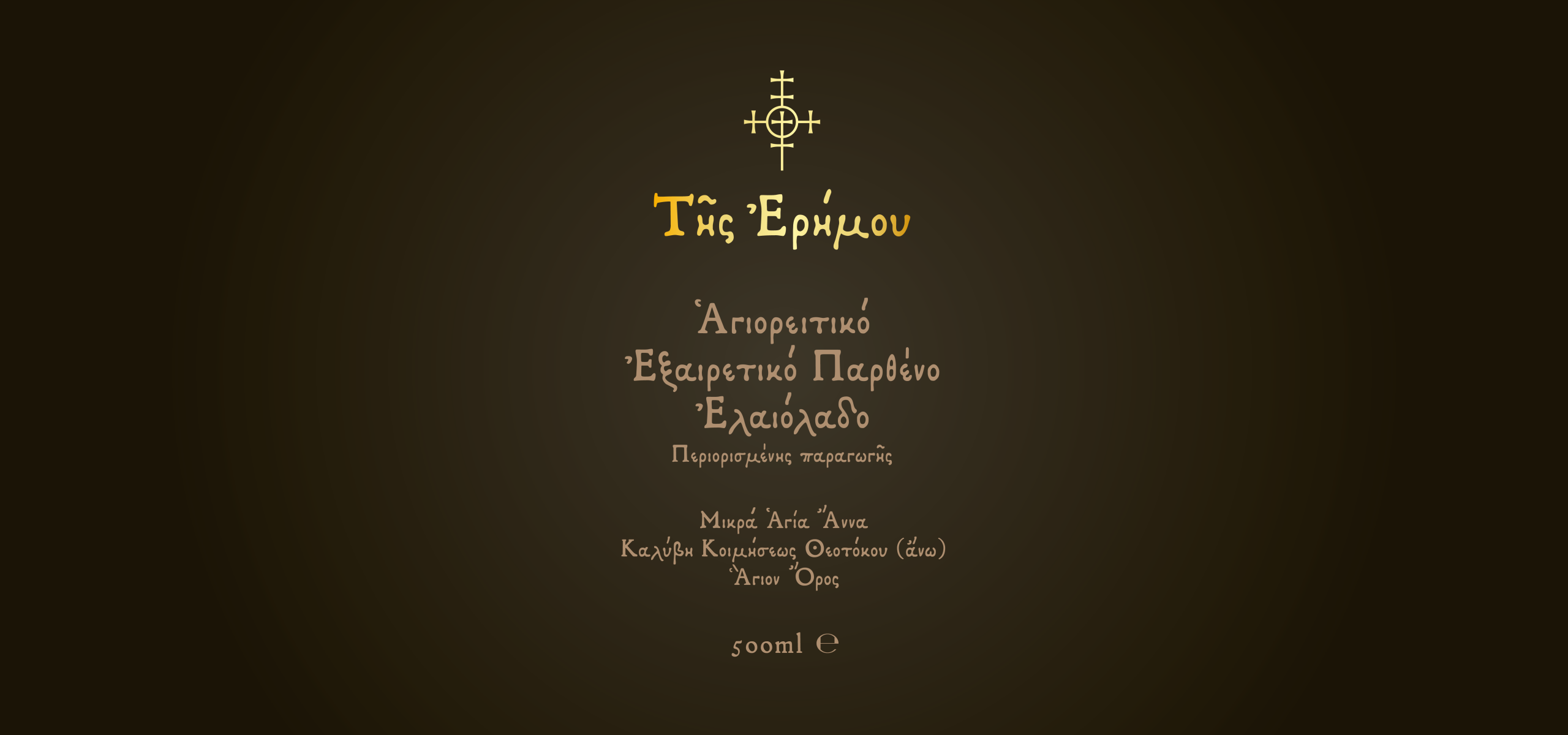
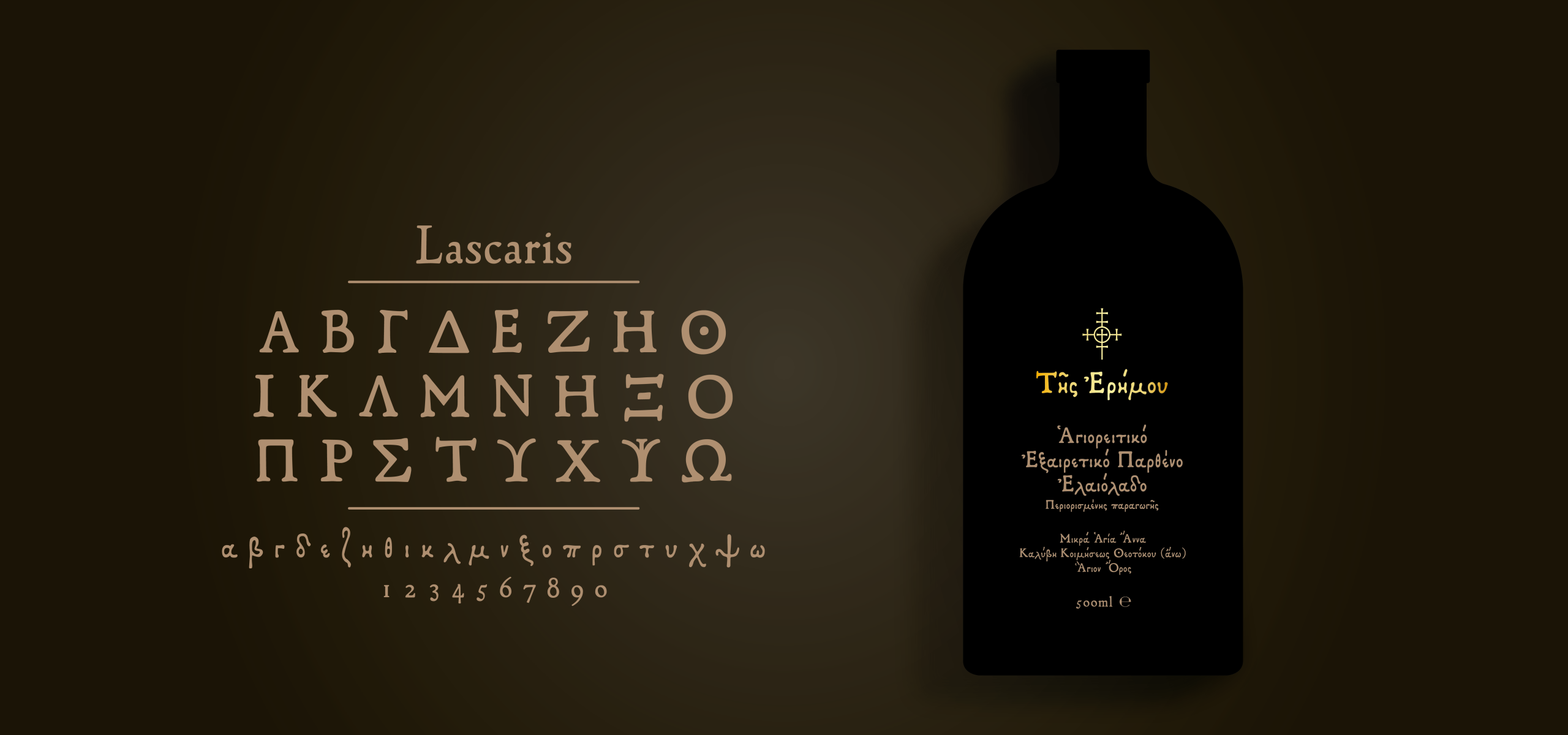
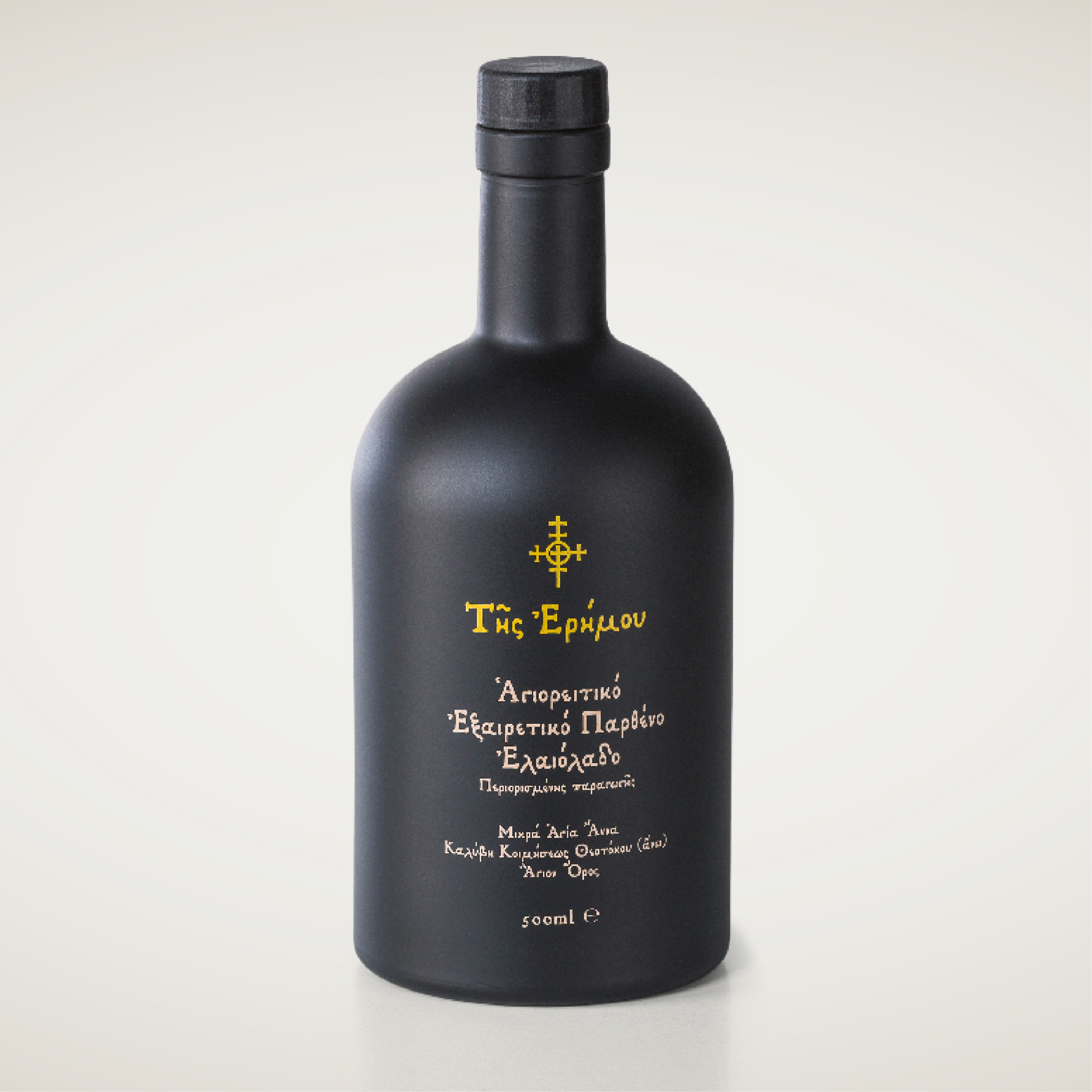
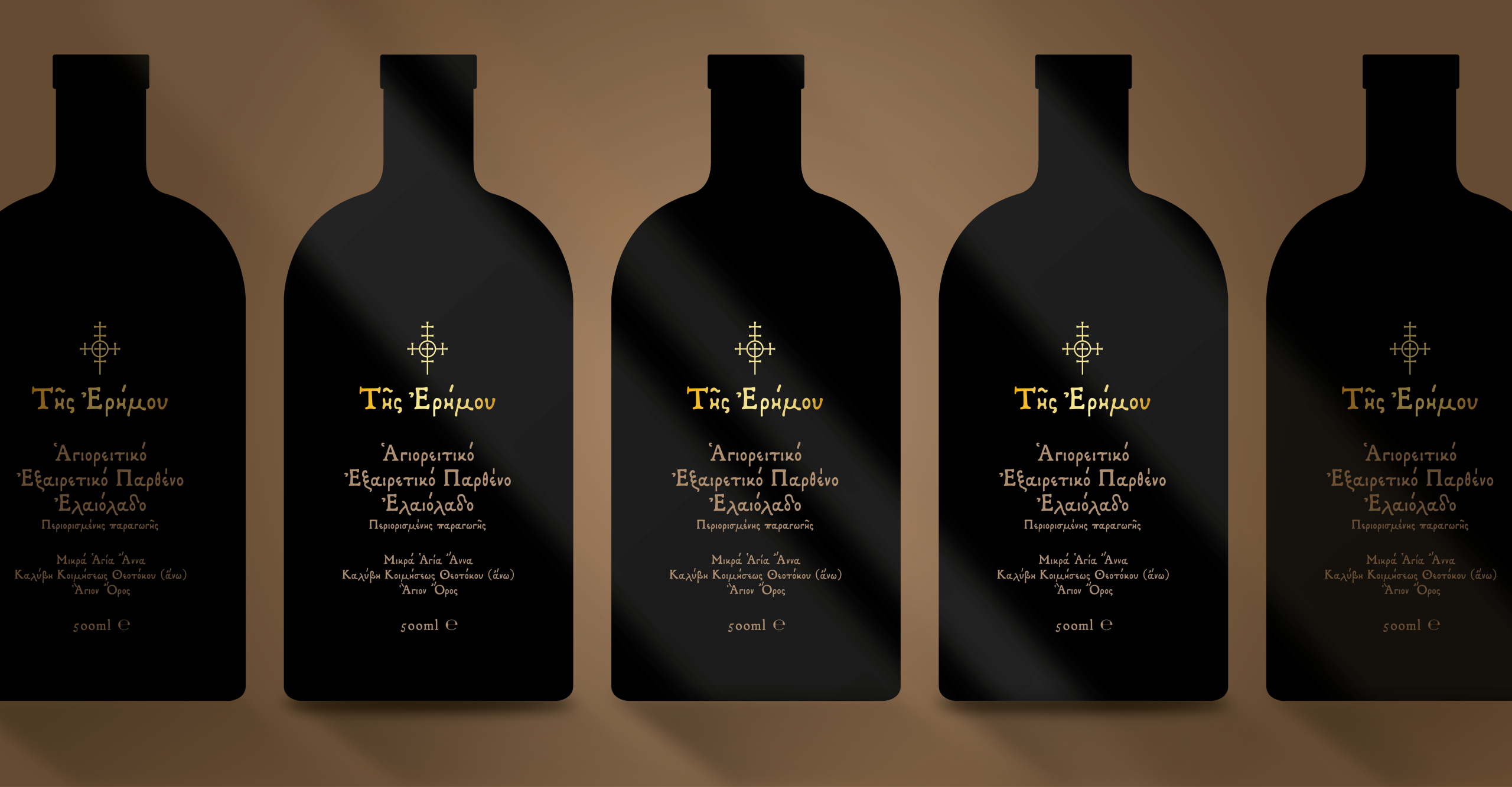
Branding Packaging Design October 1, 2025

Ladi tis Erimou

New Communication was entrusted with the branding and packaging design for “Tis Erimou,” an extra premium olive oil produced by the Monks of Mikra Agia Anna Monastery on Mount Athos (Agio Oros), Greece.

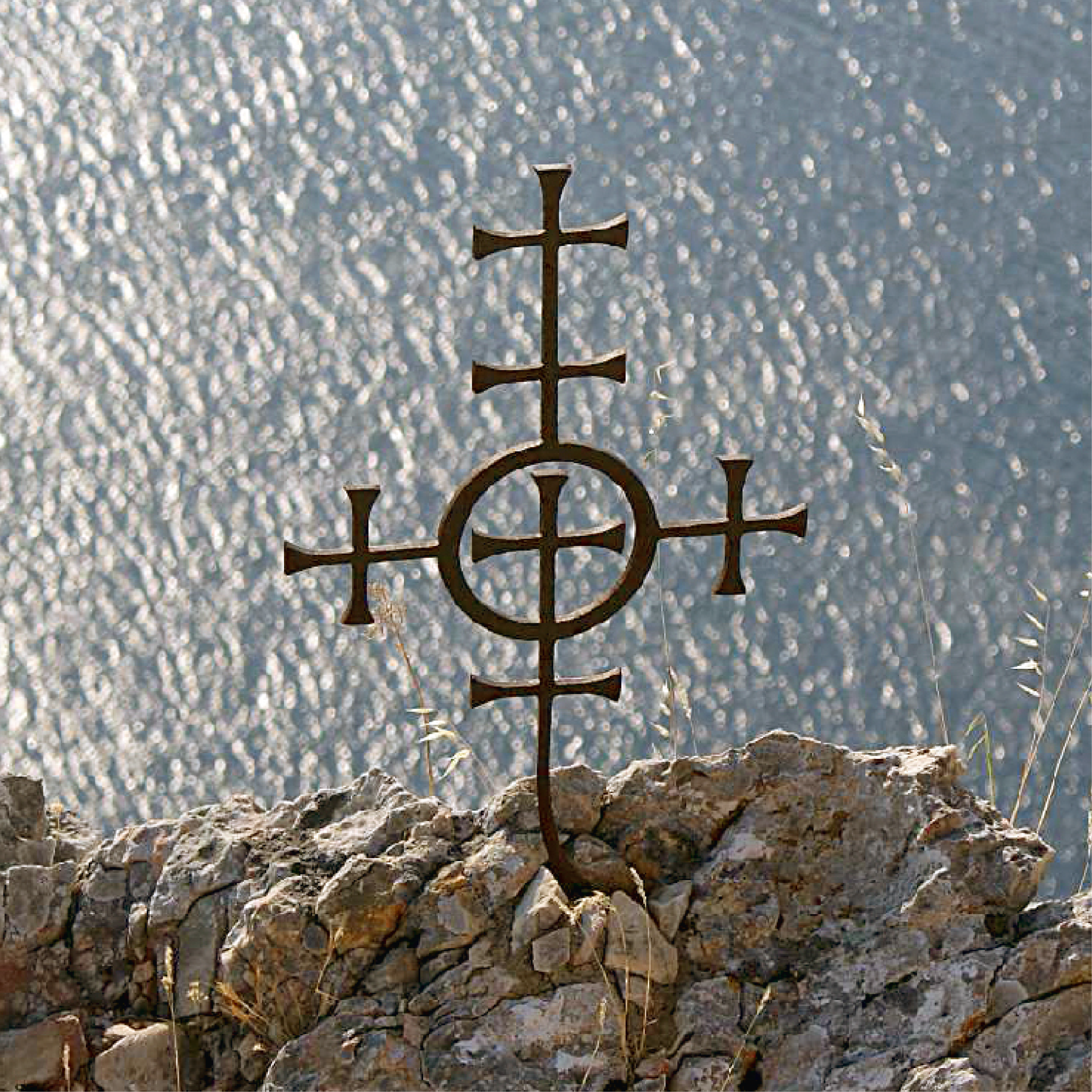
The project was an inspiring opportunity to promote a great product’s exceptional quality and flavour, while celebrating the long, deep history and religious character of its origin.
The final design successfully elevated the product to an exclusive, world-class luxury item rooted in spiritual tradition.

  • Strategy

    Brand Strategy, Creative

  • Design

    Packaging Design, Art Direction

  • Client

    Mikra Agia Anna - Agio Oros

Brief

The monks of the Mikrá Agía Ánna Monastery in Mount Athos trusted us with the creation of a brand identity and packaging design for their extra premium olive oil.

The product, made from hand-picked olives in the unique rocky terrain of Athos, required a design that would communicate its purity, exceptional quality, and deep spiritual heritage.

The name “Tis Erimou” comes from the monastery’s surrounding landscape, often described as a “desert” with very few olive trees among rocks.

Challenge

The main challenge was to capture and communicate the authenticity and centuries-old history of monastic life while presenting the product as a luxury olive oil in the global market.

  1. Elevating to Luxury: Creating a design that positions the oil as extra premium and justifies its price point alongside international luxury food brands.
  2. Authentic Storytelling: Effectively communicating the unique, isolated origin of the oil.
  3. Visualizing History and Faith: Translating the centuries-old religious and historical essence of the monastery into a modern, yet respectful, visual language without appearing traditional or religious.

Results

New Communication delivered a profoundly resonant and elegant brand identity:

Monastic Typography as Identity: The central design element was a custom-designed, exquisite font, closely resembling handwritten manuscripts of the Monks. This typeface immediately communicates the product’s deep history and essence, establishing an authentic, spiritual connection that serves as the brand’s signature.

Premium Minimalist Execution: The design employed simplicity and dark glass packaging, ensuring the product’s focus remains on the sacred quality of the oil. The sparse, strategic use of the custom font provides an elegant, hand-crafted look, successfully positioning the oil as an authentic, world-class luxury item.

This project showcases our ability to create high-end branding for products defined by their profound cultural and geographic narrative.

Let's create something remarkable together.

Got a Project?

Back