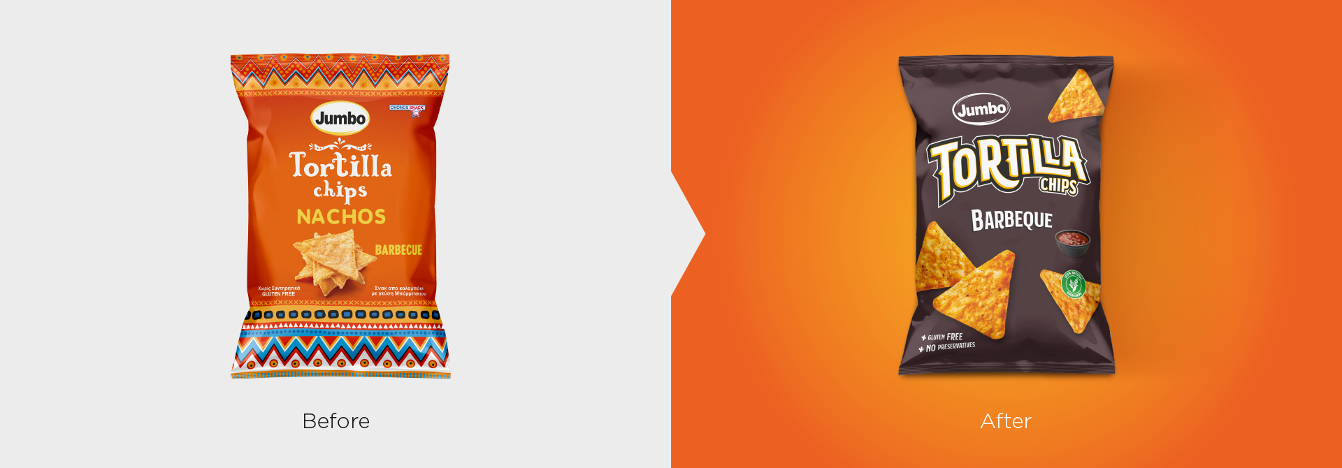
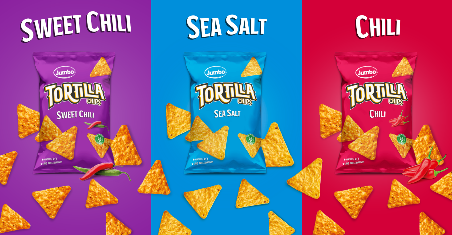
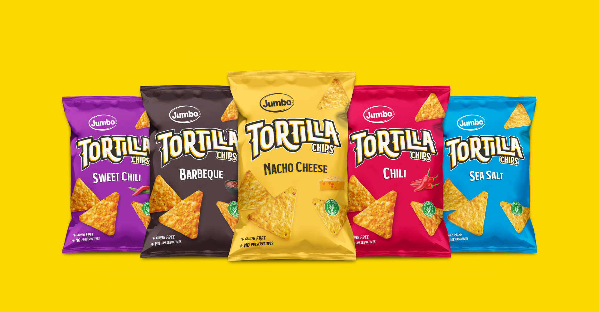
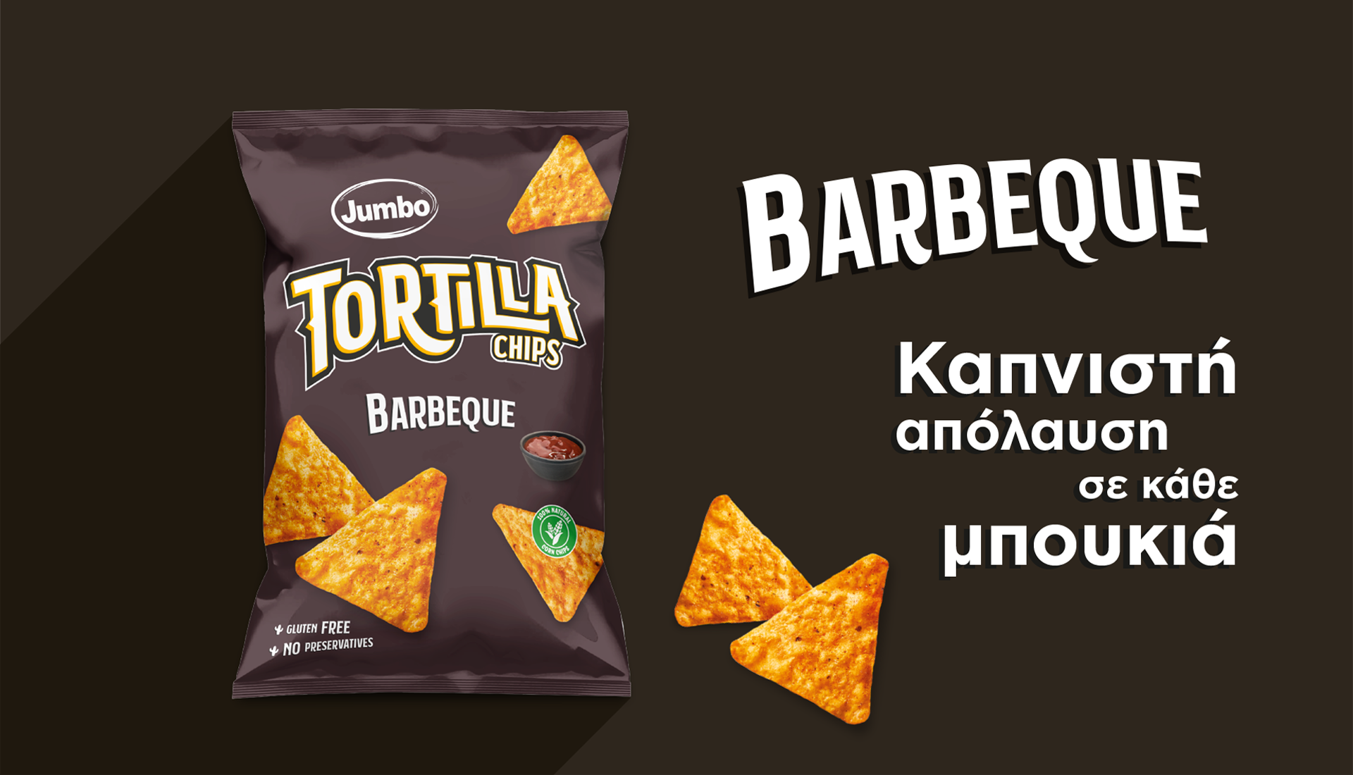
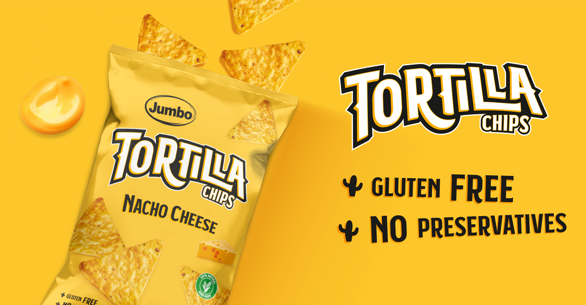
Jumbo Tortilla Chips

For Ohonos Snack, we created a bold and modern packaging identity for their new Tortilla Chips line, designed to capture the attention of millennials and Gen Z. By using vibrant, flavor-coded colors and playful typography, the design not only stands out on crowded shelves but also communicates freshness, fun, and clarity with strong claims like gluten free and no preservatives, making the product instantly appealing and easy to recognize.

  • Strategy

    Brand Strategy, Packaging Range Design

  • Design

    Packaging Design, Art Direction

  • Client

    Ohonos Snack

Brief

Ohonos Snack approached us to redesign the packaging for their Tortilla Chips line, aiming to create a modern and appealing look that resonates with younger audiences while highlighting the brand’s quality claims.

The goal was to develop a packaging family that is both eye-catching and functional, ensuring consumers can easily identify each flavor at a glance.

Challenge

The previous packaging lacked differentiation and did not communicate the fun, bold, and vibrant character of the product.

We needed to design a packaging system that stood out on shelves, appealed directly to millennials and Gen Z, and created a strong flavor association through design while keeping health-conscious claims (gluten free, no preservatives) front and center.

Result

We designed a colorful, dynamic packaging identity where each flavor is represented by a distinct bold color.

Yellow for Nacho Cheese, Blue for Sea Salt, Red for Chili, Purple for Sweet Chili, and Brown for Barbeque.

The playful typography, enhanced with custom character adjustments, makes the brand approachable and energetic, while the clean layout ensures visibility of product claims.

The result is a packaging family that is vibrant, recognizable, and appealing, helping Ohonos Snack position Tortilla Chips as a modern snack choice for younger consumers.

Let's create something remarkable together.

Got a Project?

Back